
Firstly, to have some visual view about this post, you can take a look at this demo video:
A - CardView
1 – What is CardView?
CardView was brought along with Android 5.0 Lollipop. It extends FrameLayout and has rounded background with shadow by default.
CardView is convenient for displaying complex content that has multiple heterogeneous data type like images, text, videos…

2 – How to use CardView
To be able to use CardView in your application, you have to declare the required dependencies like below:
dependencies {
	compile 'com.android.support:appcompat-v7:21.0.0'
	compile 'com.android.support:cardview-v7:21.0.+'
}
After that, in you layout XML file, you also need to declare the card_view namespace:
xmlns:card_view=http://schemas.android.com/apk/res-autoNow you can play with CardView :D
Like other controls, you can add CardView to the layout using XML.
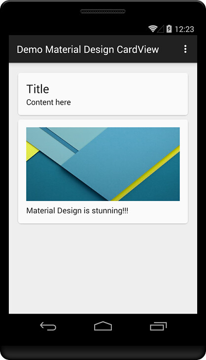
You can add not only TextView into CardView:
<android.support.v7.widget.CardView
	android:layout_width="fill_parent"
	android:layout_height="wrap_content"
	card_view:contentPadding="16dp"
	card_view:cardElevation="2dp"
	card_view:cardCornerRadius="5dp">

	<LinearLayout
		android:layout_width="fill_parent"
		android:layout_height="wrap_content"
		android:orientation="vertical">

		<TextView
			style="@style/Base.TextAppearance.AppCompat.Headline"
			android:layout_width="fill_parent"
			android:layout_height="wrap_content"
			android:text="Title" />

		<TextView
			style="@style/Base.TextAppearance.AppCompat.Body1"
			android:layout_width="fill_parent"
			android:layout_height="wrap_content"
			android:text="Content here" />

	</LinearLayout>

</android.support.v7.widget.CardView>
But also other kind of controls like ImageView, Button…
<android.support.v7.widget.CardView
	android:layout_width="fill_parent"
	android:layout_height="wrap_content"
	card_view:contentPadding="16dp"
	card_view:cardElevation="2dp"
	card_view:cardCornerRadius="5dp">

	<LinearLayout
		android:layout_width="fill_parent"
		android:layout_height="wrap_content"
		android:orientation="vertical">

		<ImageView
			android:layout_width="fill_parent"
			android:layout_height="150dp"
			android:src="@drawable/sample"
			android:scaleType="fitXY"/>

		<TextView
			style="@style/Base.TextAppearance.AppCompat.Body1"
			android:layout_width="fill_parent"
			android:layout_height="wrap_content"
			android:layout_marginTop="8dp"
			android:text="Material Design is stunning!!!" />

	</LinearLayout>

</android.support.v7.widget.CardView>
As you can see on above XML code, CardView provides some properties like
- contentPadding: setting padding for CardView
- cardElevation: new concept in Material Design that represents for z axis
- cardCornerRadius: setting radius for card rounded corner
Demo result:
B – RecyclerView
1 – What is RecyclerView?
RecyclerView is an “upgraded” version of ListView which is more advance and flexible.
RecyclerView is a container for displaying large data sets that can be scrolled efficiently by maintaining a limited number of views.
RecyclerView also provides some default animations for common item operations like inserting or removing an item.
2 – How to use RecyclerView?
To be able to use RecyclerView in your application, you have to declare the required dependencies like below:
dependencies {
compile 'com.android.support:appcompat-v7:21.0.0'
compile 'com.android.support:recyclerview-v7:21.0.+'
}
To use RecyclerView, you have to create 2 essential components:
- LayoutManager: positions items in RecyclerView and determines when to reuse item views that are no longer visible to the user.
- RecyclerView.Adapter: provides access to data sets items, creates views for items and binds items info to item view.
2.1 – LayoutManager
RecyclerView provides some built-in LayoutManager that you can use immediately:
- LinearLayoutManager: provides similar functions to ListView
- GridLayoutManager: lays out all items in a grid
- StaggeredGridLayoutManager: lays out all items in a staggered grid formation, supports horizontal and vertical layouts and is able to lay out items in reverse.
2.2 – RecyclerView.Adapter
Adapter provides access to all the items in dataset.
Adapter also takes responsibility to create view for each item and replace new content for the view whenever the original item is no longer visible.
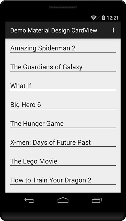
3 – Demo simple RecyclerView
In this demo, we will create a simple demo to show you how to use RecyclerView in your Android application. Actually, it’s quite similar to ListView implementation.
First, place RecyclerView into your layout:
<?xml version="1.0" encoding="utf-8"?>
<LinearLayout xmlns:android="http://schemas.android.com/apk/res/android"
	android:layout_width="match_parent"
	android:layout_height="match_parent"
	android:orientation="vertical">

	<android.support.v7.widget.RecyclerView
		android:id="@+id/recycler_view"
		android:layout_width="match_parent"
		android:layout_height="match_parent"/>

</LinearLayout>
Retrieve it in your code:
RecyclerView mRecyclerView;

@Override
protected void onCreate(Bundle savedInstanceState) {
	super.onCreate(savedInstanceState);
	setContentView(R.layout.activity_recycler_view);
	mRecyclerView = (RecyclerView)findViewById(R.id.recycler_view);
}
If you’re 100% sure that the item layout size will not change in future, call setHasFixedSize() method with true value. This will help RecyclerView improve its performance significantly.
mRecyclerView.setHasFixedSize(true);Next, create a LayoutManager and set it to the RecyclerView. Here, I use the built-in LayoutManager – LinearLayoutManager this simple demo. In next post, I’ll show you how to customize LayoutManager.
mLayoutManager = new LinearLayoutManager(this);
mRecyclerView.setLayoutManager(mLayoutManager);
Then, we need to create the third essential component – the Adapter.
Before touching the Adapter, we need to create a layout for RecyclerView item:
<?xml version="1.0" encoding="utf-8"?>
<LinearLayout xmlns:android="http://schemas.android.com/apk/res/android"
	android:orientation="vertical" android:layout_width="match_parent"
	android:layout_height="wrap_content"
	android:padding="@dimen/activity_horizontal_margin">

	<TextView
		android:id="@+id/tv_recycler_view_item"
		android:layout_width="wrap_content"
		android:layout_height="wrap_content"
		style="@style/Base.TextAppearance.AppCompat.Large"/>

	<LinearLayout
		android:layout_width="fill_parent"
		android:layout_height="1dp"
		android:background="#000"></LinearLayout>

</LinearLayout>
Then, create SimpleAdapter class with below content:
public class SimpleAdapter extends RecyclerView.Adapter<SimpleAdapter.ViewHolder> {

	List<String> mItems;

	public SimpleAdapter() {
		super();
		mItems = new ArrayList<String>();
		mItems.add("Amazing Spiderman 2");
		mItems.add("The Guardians of Galaxy");
		mItems.add("What If");
		mItems.add("Big Hero 6");
		mItems.add("The Hunger Game");
		mItems.add("X-men: Days of Future Past");
		mItems.add("The Lego Movie");
		mItems.add("How to Train Your Dragon 2");
		mItems.add("Maleficent");
		mItems.add("22 Jump Street");
		mItems.add("The Maze Runner");
		mItems.add("Horrible Bosses 2");
		mItems.add("Night at the Museum 3");
	}

	@Override
	public ViewHolder onCreateViewHolder(ViewGroup viewGroup, int i) {
		View v = LayoutInflater.from(viewGroup.getContext())
		.inflate(R.layout.recycler_view_simple_item, viewGroup, false);
		ViewHolder viewHolder = new ViewHolder(v);
		return viewHolder;
	}

	@Override
	public void onBindViewHolder(ViewHolder viewHolder, int i) {
		viewHolder.itemView.setText(mItems.get(i));
	}

	@Override
	public int getItemCount() {
		return mItems.size();
	}

	class ViewHolder extends RecyclerView.ViewHolder{
		public TextView itemView;
		public ViewHolder(View itemView) {
			super(itemView);
			this.itemView = (TextView)itemView.findViewById(R.id.tv_recycler_view_item);
		}
	}
}
As you can see in the SimpleAdapter class:
- Constructor: where we get the dataset that can be passed from parameter or created inside the constructor
- ViewHolder class: extends ViewHolder and contains all components, controls of item view
- onCreateViewHolder(): where we inflate the item layout and create ViewHolder
- onBindViewHolder(): where we manipulate item info into ViewHolder’s components and controls
- getItemCount(): return the dataset size
After that, we need to create an instance of the Adapter and assign to RecyclerView:
RecyclerView.Adapter mAdapter;
mAdapter = new SimpleAdapter();
mRecyclerView.setAdapter(mAdapter);
Run the application and enjoy the result:
C – Combine CardView and RecyclerView
After 2 sections above, we all know that CardView and RecyclerView are very powerful and flawless components.
In this section, I’ll show you how to combine CardView and RecyclerView to create stunning view displaying a dataset.
Firstly, create the layout for each item using CardView:
<?xml version="1.0" encoding="utf-8"?>
<LinearLayout xmlns:android="http://schemas.android.com/apk/res/android"
	xmlns:card_view="http://schemas.android.com/apk/res-auto"
	android:layout_width="match_parent"
	android:layout_height="match_parent"
	android:orientation="vertical">

	<android.support.v7.widget.CardView
		android:layout_width="fill_parent"
		android:layout_height="wrap_content"
		card_view:contentPadding="@dimen/activity_horizontal_margin"
		card_view:cardCornerRadius="3dp">

		<ImageView
			android:id="@+id/img_thumbnail"
			android:layout_width="fill_parent"
			android:layout_height="150dp" />

		<TextView
			android:id="@+id/tv_movie"
			android:layout_width="fill_parent"
			android:layout_height="50dp"
			android:paddingLeft="@dimen/activity_horizontal_margin"
			android:paddingRight="@dimen/activity_horizontal_margin"
			android:layout_gravity="bottom"
			android:gravity="center_vertical"
			android:background="#757575"
			android:alpha="0.8"
			android:textSize="@dimen/abc_text_size_headline_material"
			android:text="Test"/>

	</android.support.v7.widget.CardView>

</LinearLayout>
This demo will display a list of Movie info with name and thumbnail. So that we also need to create an entity class for Movie:
public class Movie {
	private String mName;
	private int mThumbnail;

	public String getName() {
		return mName;
	}

	public void setName(String name) {
		this.mName = name;
	}

	public int getThumbnail() {
		return mThumbnail;
	}

	public void setThumbnail(int thumbnail) {
		this.mThumbnail = thumbnail;
	}
}
Then, create CardAdapter class that similar to SimpleAdapter above. Instead only one TextView, now the ViewHolder will have the ImageView to display the movie thumbnail as well.
public class CardAdapter extends RecyclerView.Adapter<CardAdapter.ViewHolder>{
	List<Movie> mItems;

	public CardAdapter() {
		super();
		mItems = new ArrayList<Movie>();
		Movie movie = new Movie();
		movie.setName("The Amazing Spider-Man 2");
		movie.setThumbnail(R.drawable.spiderman);
		mItems.add(movie);

		movie = new Movie();
		movie.setName("X-men: Days of Future Past");
		movie.setThumbnail(R.drawable.xmen);
		mItems.add(movie);

		movie = new Movie();
		movie.setName("The Hunger Game");
		movie.setThumbnail(R.drawable.hungergame);
		mItems.add(movie);

		movie = new Movie();
		movie.setName("Guardians of the Galaxy");
		movie.setThumbnail(R.drawable.guardians_of_the_galaxy);
		mItems.add(movie);

		movie = new Movie();
		movie.setName("Maleficent");
		movie.setThumbnail(R.drawable.maleficent);
		mItems.add(movie);

		movie = new Movie();
		movie.setName("How to Train Your Dragon 2");
		movie.setThumbnail(R.drawable.howtotrainyourdragon);
		mItems.add(movie);

		movie = new Movie();
		movie.setName("What If");
		movie.setThumbnail(R.drawable.whatif);
		mItems.add(movie);
	}

	@Override
	public ViewHolder onCreateViewHolder(ViewGroup viewGroup, int i) {
		View v = LayoutInflater.from(viewGroup.getContext())
		.inflate(R.layout.recycler_view_card_item, viewGroup, false);
		ViewHolder viewHolder = new ViewHolder(v);
		return viewHolder;
	}

	@Override
	public void onBindViewHolder(ViewHolder viewHolder, int i) {
		Movie movie = mItems.get(i);
		viewHolder.tvMovie.setText(movie.getName());
		viewHolder.imgThumbnail.setImageResource(movie.getThumbnail());
	}

	@Override
	public int getItemCount() {
		return mItems.size();
	}

	class ViewHolder extends RecyclerView.ViewHolder{

		public ImageView imgThumbnail;
		public TextView tvMovie;

		public ViewHolder(View itemView) {
			super(itemView);
			imgThumbnail = (ImageView)itemView.findViewById(R.id.img_thumbnail);
			tvMovie = (TextView)itemView.findViewById(R.id.tv_movie);
		}
	}
}
Finally, invoke an instance of CardAdapter and set it to RecyclerView:
 mAdapter = new CardAdapter();
 mRecyclerView.setAdapter(mAdapter);
Now you can run and enjoy the result when combine CardView and RecyclerView:

D - Download Source Code CardView and RecyclerView in Material Design
https://github.com/trinhlbk1991/DemoCardViewRecyclerView
Big Note
I saw a lot of you asking about handling on item clicked listener in Recycler View, so I decided to implement it.
Please checkout the code on github for implementation details.