
Sometime, you don’t want to use provided buttons style of Android like this:

You want something’s special, an GUI in your own and unique style.
In this post, we will create a custom button using basic Button control and XML file that defines 3 different states of the button: normal, focused and pressed.
First, copy 3 images below into res/drawable folder. These images will be the custom button’s background in 3 different states:


Next, add new an xml file with below content:
<?xml version="1.0" encoding="utf-8"?>
<selector xmlns:android="http://schemas.android.com/apk/res/android" >

    <item android:drawable="@drawable/android_pressed"
        android:state_pressed="true"></item>

    <item android:drawable="@drawable/android_focused"
        android:state_focused="true"></item>

    <item android:drawable="@drawable/android_normal"></item>

</selector>
This xml file will define the background of custom button base on its state (pressed, focused or normal).
Please note that the order of <item> tags is very important. Like this above xml file, the button will be marked as normal if it was not in pressed and focused state.
Move to the next step - add a new Button to the main activity layout:
<RelativeLayout xmlns:android="http://schemas.android.com/apk/res/android"
    xmlns:tools="http://schemas.android.com/tools"
    android:layout_width="match_parent"
    android:layout_height="match_parent"
    android:paddingBottom="@dimen/activity_vertical_margin"
    android:paddingLeft="@dimen/activity_horizontal_margin"
    android:paddingRight="@dimen/activity_horizontal_margin"
    android:paddingTop="@dimen/activity_vertical_margin"
    tools:context=".MainActivity" >

    <Button android:id="@+id/btnCustom"
        android:layout_width="wrap_content"
        android:layout_height="wrap_content"
        android:padding="10dp"
        android:background="@drawable/custom_android_button"/>

</RelativeLayout>
You can easily see that beside usual attributes like id, width, height, padding, we assign background attribute to the custom_android_button style which we defined before.
Finally, to implement something when the button was pressed, we override the OnClickListener in code behind:
public class MainActivity extends Activity {

    @Override
    protected void onCreate(Bundle savedInstanceState) {
        super.onCreate(savedInstanceState);
        setContentView(R.layout.activity_main);

        Button btnCustom = (Button)findViewById(id.btnCustom);
        btnCustom.setOnClickListener(new OnClickListener() {

            @Override
            public void onClick(View v) {
                Toast.makeText(getApplicationContext(), "You clicked custom button!", Toast.LENGTH_SHORT).show();
            }
        });

    }
}
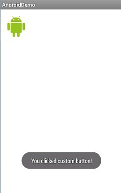
As a result of those above code, there will be a message when you click the custom button:


Source code:
https://drive.google.com/file/d/0BzvV1wN-WHWwSGhweUhabGlRRmM/edit?usp=sharing