
In previous post “Custom Button” we know how to customize a default Button of Android.
Similarly, in this post, I will show you the way to customize default Radio Button and Checkbox using XML file and desired images.
Copy these images to res/drawable folder:


Define an XML file to specify desired appearance for each state of Radio Button:
<?xml version="1.0" encoding="utf-8"?>
<selector xmlns:android="http://schemas.android.com/apk/res/android" >
    <item android:state_checked="true" android:drawable="@drawable/checkedradiobutton"></item>
    <item android:state_checked="false" android:drawable="@drawable/unchekedradiobutton"></item>
</selector>
Declare Radio Buttons in main activity layout:
<RadioGroup
        android:id="@+id/radGroup"
        android:layout_width="wrap_content"
        android:layout_height="wrap_content"
        android:layout_below="@+id/btnCustom" >

        <RadioButton android:id="@+id/radDefault"
        android:layout_width="wrap_content"
        android:layout_height="wrap_content"
        android:text="This is the default radio button"
        android:checked="true"/>

        <RadioButton android:id="@+id/radCustom"
        android:layout_width="wrap_content"
        android:layout_height="wrap_content"
        android:text="This is the custom radio button"
        android:button="@drawable/custom_radio_button"/>
</RadioGroup>
Remember to assign button attribute to the XML file we defined before.
Do the similar steps with Checkboxes:
Firstly is custom images:


XML file:
<?xml version="1.0" encoding="utf-8"?>
<selector xmlns:android="http://schemas.android.com/apk/res/android" >
    <item android:state_checked="true" android:drawable="@drawable/checked"></item>
    <item android:state_checked="false" android:drawable="@drawable/unchecked"></item>
</selector>
Assign value to Checkbox button attribute:
<CheckBox
        android:id="@+id/checkCustom"
        android:layout_width="wrap_content"
        android:layout_height="wrap_content"
        android:layout_below="@+id/checkDefault"
        android:checked="true"
        android:text="This is custom checkbox"
        android:button="@drawable/custom_check_box">
        This is custom check box
</CheckBox>
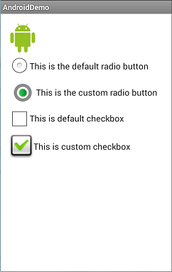
And the result is so … fabulous:
Source code:
https://drive.google.com/file/d/0BzvV1wN-WHWwaW1NLTVMZGl1X2M/edit?usp=sharing